
Large Print Books: Font Size and Layout That Work
A large print edition is more than a bigger font. APH’s research-based rules set the floor at 18 point, and on KDP the edition needs its own ISBN.
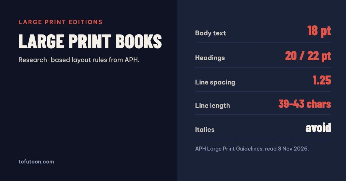
A large print book sets its body text at 18 point or larger, with headings at about 20 and 22 point, generous line spacing and short lines. Text between 12 and 18 point is only “enlarged print”. Those thresholds come from the American Printing House for the Blind (APH), whose research-based guidelines also cover fonts, italics, colour and paper. On KDP a large print version is a separate edition with its own ISBN and its own page count.
What counts as a large print book?
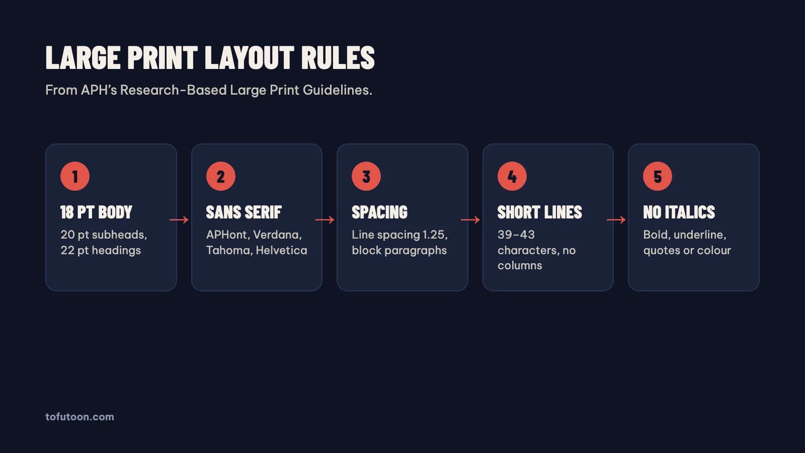
According to APH’s Guidelines for the Development of Documents in Large Print, a document is not actually large print unless its font size is 18 points or larger (APH: Large Print Guidelines). The usual smallest settings are 18 point for body text, 20 point for subheadings and 22 point for headings. Anything above 12 but below 18 point is called “enlarged print”, and APH states plainly that it does not meet the requirements of large print. This matters for how you describe an edition. A book reset from 11 to 14 point is easier to read, but calling it large print sets an expectation it does not meet for readers with low vision, the people that label is meant for. APH writes these guidelines for documents and textbooks for readers with low vision, so treat 18 point as the honest floor for any book sold as large print, not a design ceiling.
Which fonts and styles work for large print?
APH recommends fonts without serifs and lists APHont, Verdana, Tahoma, Helvetica and Antique Olive as acceptable, with Comic Sans when a contrasting font is needed. It also asks for x and t heights of about 1/8 inch. APHont is APH’s own font for low-vision readers, free to download for anyone who makes documents for them. Italics are avoided because many people with low vision find them hard to read; APH gives four replacements: bold, underlining, quotation marks, or a contrasting colour. Paragraphs are not indented but set as blocks with a blank line between them. Before using any font in a KDP print book, also check that it embeds in the PDF and that its licence allows commercial print, which KDP makes the author responsible for.
How should a large print page be laid out?
APH recommends line spacing of 1.25 and a line length of 39 to 43 characters, which its research found best for reading efficiency. Columns are discouraged: the hardest task for a reader with low vision is the jump from the end of one line to the start of the next, and columns repeat that jump. In a table of contents, APH advises against dotted leader lines to the page number and suggests shading every other line in a pastel colour instead. For paper, white with black text gives the most contrast, but glare bothers some readers, so ivory, eggshell or light beige are good options; gray paper and gray text are not recommended at all. Images should be enlarged without losing resolution or colour. For student books APH sets an upper size of 9 × 12 × 2.5 inches and 2.5 pounds, a useful reminder that large print should still be comfortable to hold.
How do you publish a large print edition on KDP?
On KDP a large print version is a new book, not an update. KDP’s edition rules say that changes to trim size, ISBN, or a page count change of more than 10% require a new edition and a new title setup (KDP: Book Titles and Editions). A large print reset changes the page count far more than that, so it gets its own ISBN, its own interior PDF and its own cover with a wider spine; the KDP cover size and spine width guide shows how page count sets that spine. Plan the trim with page limits in mind: on white paper the regular KDP trims allow up to 828 pages, and 8.5 × 11 inches only 590 (KDP: Set Trim Size). A long novel at 18 point can approach those limits, which may mean a larger trim or two volumes. KDP’s minimum font size of 7 point is irrelevant here (KDP: Paperback Fonts); the large print threshold is your real rule.
Checklist for a large print edition
- Body text 18 point or larger; subheadings 20 point; headings 22 point.
- A sans-serif font that embeds and that you are licensed to print with.
- Line spacing about 1.25, lines of roughly 39 to 43 characters, one column.
- Bold, underline or quotes instead of italics; block paragraphs.
- No leader dots in the contents; cream or ivory paper if glare is a concern.
- A new KDP title with its own ISBN, page count and cover.
FAQ
Is 16 point large print?
Not by the APH definition. APH calls anything above 12 and below 18 point “enlarged print” and says it does not meet the requirements of large print. Use 18 point or more for the body if you label the book large print.
Can the Kindle eBook be large print?
A reflowable Kindle eBook lets every reader pick the text size, so it does not need a separate large print version. Large print matters for the printed edition.
Next step: a large print edition usually lands on a different page count and trim, so check the options in the free KDP trim size guide, price it with the KDP royalty calculator, and size its wider cover with the KDP cover calculator. Our pay-once book formatter for Windows and Mac, still in development, turns a Word manuscript into a print PDF and an EPUB, offline; a large print edition option is planned for a release after the first one. If that is what you need, join the waitlist.